LI.I.A.R Analsis
The Language:
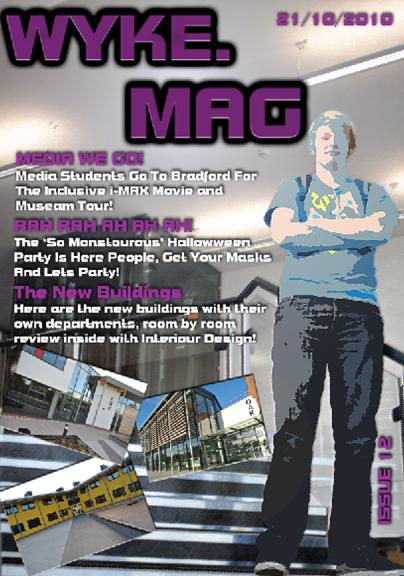
I have used the type of text for the mast head because it would appeal to a younger reader as it looks very modern and also it looks professional, it isnt under the influence of bright colours and poor image manipulation either. The image is a medium shot of two people on the front of the magazine. It also showing the students of the college which is a good thing too. It would appeal to students at the college and it would also appeal to the older audiences too. There are other images of the college splashed about the magazine too which shows all three buildings of the college. The text is a good colour as it doesnt clash with anything in the background or cover the people on the front of the magazine. The purple matches the mast head and subtitle on the headlines which is very good as it is consistant along with the ussue number and the date.
The Institution:
The three college images on the front of the magazine display the college to be a modern site and somewhere that young people would like to learn too. The college buildings would also appeal to the parents too, the questions that the partents would ask would be if they want to send their children to this college. Its new and it is newly built too. There also is a background image of the college walkway in the background of teh two students on the magazine too.
The Ideology:
The ideology or the belief that i wish to put across would be to value the education at the college, it has been put in a good light too and not anything negative, there are good images of the college, the signs are scruffy or falled off, they look neat and tidy and it is more of a reason for their parents to send the students to this college too.
The Audience:
The audience of this magazine would be a great age range like from the students to the parents. It would appeal to the students because it is students that are the main image on the front page and they would want to read something with younger models on the front page. It would also appeal to a older audience too as if they read something they is aimed at a younger audience then they would like to read it, making them feel younger and more filled with youth. They also would be the parents of the students that are the audience, for the main reason, it would be to see if they college is up to scratch and if it is the right desicion for them and the students.
The Representation:
The magazine would represent to education, it would represent a happy environment to work in as well. I have took a image of two students in the college ground, as you can see, i have put it on the left bottom corner of the magazine, these students appeal to the target audience that i would have expected.
22/10/2010
Final Magazine Developoment Version 2
Here is the development of the magazine in the different steps of progress.
1.
 On this magazine, i think that there is too much blank space on the magaine front cover, i had to change the original as it was not a body shot, instead it was a long shot instead, i really liked that one and i spent the most time on that too. I will also need to change the text above the main image as it does clash with the white space at the back of it.
2.
.jpg)
Here is my final design of the magazine, it has a even body shot of two people and it also has all the information that version 1 has too. This one does have some blank spaces but it is covered with the masthead, the date and also the images.
1.

2.
.jpg)
Here is my final design of the magazine, it has a even body shot of two people and it also has all the information that version 1 has too. This one does have some blank spaces but it is covered with the masthead, the date and also the images.
Final Magazine Developoment Version 1
The Front Page:
 You may not be able to see the two differences that i have made on the magazine, i have added another filter to the background and also to Adam. It has sharpened both the background and Adam in this front page. Ive also added a lens flair (It is like a spot light on the page) behind the masthead of my magazine to make it look a little more like brightened up.
I truly think that this is my best work that i have done in Adobe Photoshop. (Very happy)
Contents Page:

Here is the completed contents page with all of the imported images and new effects that i have added to the magazine, i have even added a page number as all magazines do have them. I also added effects on the shapes that i have used too. It was a good effect and i liked it too so i decided on using it.
I have done all of my originals now and onto the evaluation.
I truly think that this is my best work that i have done in Adobe Photoshop. (Very happy)
Contents Page:
Here is the completed contents page with all of the imported images and new effects that i have added to the magazine, i have even added a page number as all magazines do have them. I also added effects on the shapes that i have used too. It was a good effect and i liked it too so i decided on using it.
I have done all of my originals now and onto the evaluation.
21/10/2010
My Drafts From Photoshop (Front Cover and Contents Page)
Front Cover
 Here is the draft copy of my magazine front cover, at the moment i think it looks pretty plain and will be improving more on it the next time round, it just could be the change of the background colour to another filter
Contents Page
 Here is the draft copy of my contents page, there are red boxes that represent missing images and headlines which i would input after my magazine is complete, right now this is the main draft design of the contents page and how it should look when it is complete but with images.
Contents Page
Hand Drawn Drafting and Photographs That I will Be Using In My Front Page

Below are the images that i have used for the magazine and are most relevant to the draft of set 1.
IMAGES UPLOAD AT COLLEGE
Name Planning For The College Magazine

Here is my planning for the names that i will be using for my magazine, I have decided on prioritising three of them because i like them so much
I will be using the name 'Wyke.Mag' as my masthead of my magazine and if that isnt good when designed then i will be using the masthead 'The Only Wyke', and if that doesnt work then i will use my third masthead with 'Wyke Everything'. I think that these college mastheads are very good and i have decided to pick three out of six just in case anything goes wrong.
Analysis Of The Second College Magazine (L.I.I.A.R)
College Magazine research and Analysis
Research Sample 2:
East Riding College Student Life Magazine

here is the front cover and contents page of the East Riding College Magazine and it is very plain and it used the basic tones, black and white which does make the magazine very classy and attractive to different people. There are high in contrast which is very good cause it can become eye catching as well. it does have a main picture which says 'Media Students in Berlin' which is a very nice touch which could present that this is the college for the great trips and also the college that likes to offer different and more open opportunities too. the logo is quite big but not too big that it takes up the full page, just big enough so that the reader knows where the magazine was created from and for whom. The text is very constant too, it is all in the same font type and it is also in a relevant size too, it isn't too big to block up the whole of the image. It has a few empty spaces on the magazine too which isn't as attractive as sample 1.
On the contents page it has a number of different images of students doing activities and also this could be to display again that this is the college that organises big trips to students. It also has a strange green table for the writing and it doesn't look attractive at all, it would have been better if they had something like a box around it with a think black line around it with the tone white inside it.
L.I.I.A.R Analysis
The language:
In the language, the image on the front cover is positioned in the middle of the page, mainly because it could be that the magazine revolved around that image. it has white text on the page that separated it from the background and makes it stand out a lot more then putting colours that are busy on the eyes. It looks very plain too, nothing too important was used on this front page, i think that more planning and design could have been put into this front cover. The image on the front page is positioned behind the students in as i assume from the caption of the image, in Berlin.
On the contents page, there is a green box positioned on the left of the page with all of the contents listed in black and bold writing. There are a number of images that are placed on the contents page which could represent the achievements and trips that the students of the college go to.
On the contents page, there is a green box positioned on the left of the page with all of the contents listed in black and bold writing. There are a number of images that are placed on the contents page which could represent the achievements and trips that the students of the college go to.
The Institution:
I don't think that the magazine does represent a institution as the cover is very bleak and not very attractive at all and it doesn't really give the college an attractive look to it. The contents page is very different, it has a new different colour which i don't think works with the black and white tones that they have tried using and it is pretty off-putting to the reader. it has many images on the contents page which aren't relevant to the magazine at all, it would have been better if there was a caption on the images for what it is in the image, yes it does make the college look interesting but it doesn't look too good if there isn't anything more to read about as seeing the images may excite the reader but may become disappointed if there was no more information in the magazine. Also there could be a separate section for the trips that would be happening in the college itself instead of planting images everywhere around the magazine. it would have interested me a lot more.
The Ideology:
The Ideology of this magazine is like sample 1 as it does value education and and it wants to look like the college that everyone wants to go to have a better education. It also presents image on the magazine to make the college look like a fun place to be and also a place for people to socialise and make new friends which is also a good ideology which is put in the magazine like sample 1.
The Audience:
The audience for this magazine would be the students i think, mainly because it looks classy and it has images of students which would reflect on them. It also could be aimed at different businesses that let the college go paint balling and also the other activities, it could help advertise the business to other colleges that would like to do other similar things.
The Representation:
The front cover and the contents page of the magazine revolve all around the educational point of view although that the college magazine may look very gloomy and not very attractive. These high in contract tones in the magazine makes it look classy and also something that would interest a older audience too.
20/10/2010
Analysis Of The First College Magazine (L.I.I.A.R)
College Magazine research and Analysis
I shall construct a college magazines front cover and contents page using the the ideas and the analysis of other magazines and also the images and the draw designs that i had created. Using the analysis of the other magazines, i will try to make my magazine as professional as possible and also creating different samples that i will work from as well. I will make a number of drafts that will help me get to the final stage at creating the magazine front page and also the contents page.
Research Sample 1:
 |
| Here is the magazine that I have researched and analysed |
The front of the cover on the 'gx' magazine uses only a few colours and not a lot of them to make them look unprofessional or not attractive to the reader. The use of colours here work very well with the blues and also the whites too. Also the font style was made big and bold and nothing too unprofessional such as if it was to be too small and not the right colour and the right size. The text is shown very clearly and is not put all in one corner, it is spread out evenly around the front page to make it easier to read and to also make it attractive too.
L.I.I.A.R Analysis
The Language:
In the language of this magazine, the front cover had a number of calm colours that would attract readers think that it is 'cool' and 'modern'. The white gx on the front cover stands out as it bold and big which is very good and would attract a lot of readers to the magazine. it also has two genders on the front of the magazine which represents that this magazine is for both genders and not just for boys or girls. They have been cut away front the image as though it has been graphically done and their outline has been left there, this could also represent that this is a modern magazine too. The text has the same font style which is very good for consistancy and also maintains the colours in the magazine too. It has black, grey and blue writing on the front of the magazine which are the same colours on the magazine but they are positioned so that they dont clash with anything in the front cover.
On the contents page, it is pretty busy, there are different images on the contents page along with a white transparent box where all of the text is held for readers to identify where and what contents are inside the magazine there is a lot of text on the contents page too, to describe and inform about what is inside the magazine. the text is a fair size on the page, it is the right colour too, it doesnt clash with the background at all which is a very good thing, all of the text is readable which is a good think too. I think that this magazine is a streotypical teenages who likes to rave a lot and also someone who likes to party a lot and likes to listen to hardcore music and beats too.
The Institution:
The magazine cover could represent it being something modern as there is modern graphics used and there is big and bold writing used with calm and brightening colours in the background. It could also introduce a feeling of socialising too as there is informal language used on the front page and it has a welcoming theme too it too.
The Ideology:
The magazine would revolve around the Grimsby Institute and is an educational facility too. These do put an impression on the reader that this is the place to learn and also is welcoming because of the different colours in the background too. Having ideology put in place here makes the reader feel as though they are being understood by the magazine and also the way things are put to them as if it was a teenager reading the magazine and also a member of staff at the institute too.
The Audience:
I think that this magazine is aimed at pupils at the college mostly and also it is made understandable to other audiences such as the staff at the institute and also the parents of the pupils who will bring this magazine home for the parents to feel as they are a part of their life too.
The Representations:
I think that the magazine represents the college as a classy college and for it to be a very positive place to have fun and learn at the same time. It also represents that the education in the college is valued highly as the magazine doesn't look like it has been produced by a 4 year old. I also see that the college looks like it is advertising different things like new activities for students to take place in that other colleges wont offer.
 |
| This is the front page with my annotations on it |
18/10/2010
L.I.I.A.R Interpretation of My Brief
The L.I.I.A.R Interpretation of My Brief
Language:
The camera will be pointing upwards to to subject, a man and a woman will be stood with fashionable clothing on looking away from the camera and wearing glasses looking up and one looking down. it also will contain the stuff that will not put a bad influence on the magazine such as complex words that the audience will not understand and not giving the wrong idea on the audience either.
I will be using a mast head title piece which will be displayed on the top left hand corner of the magazine that I will be creating too.
Institution:
A college is creating the magazine, mainly because it is to inform about education. I will mediate the contents of the magazine so that it is not bad in anyways to give it a bad representation.
Ideology:
The ideology on the magazine would be about education and how the college values an academic point of view. Every part of my media work shall be created around the ideology of education for the college itself.
Audience:
I think that the magazine would appeal to people of all ages but mostly aimed at younger people such as teenagers. It is about teen fashion so it would appeal to the younger generation but also to the older generation too about if they wear what teens wear, then they could feel younger too.
It would also appeal to both genders, male and female as it is having both genders on the front of the magazine.
The location would be inside the college to represent that college.
Representation:
I will be considering how i will present the institution for example it will how i will represent the different gender, age and also different social groups. I think that if the contents of my magazine will be suitable for the readers as it would offend people of their age and also their sexuality. ECT.
05/10/2010
Outline Of The Brief
Outline Of The Brief
I will be creating a 'Fashion at College' magazine which will interest boys and girls to different subjects of clothing. I will analyse two different magazines that hold fashion for both boys and girls using L.I.I.A.R.
I will then draft out my magazine which consists of:
- The photography that I will use
- Where will assign where the photograph will go on the page
- What image should be on the front page of the magazine
- The different types of text that I will be using too
- What font size
- What colour
- What font
- What will be needed for the contents page
- What would be in a college magazine of fashion
I will then evaluate my work and review it on:
- What worked well
- Why it worked so well
- How it worked so well
- What didnt go so well
- Why didnt it go so well
- Can it be improved
Subscribe to:
Comments (Atom)